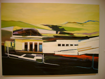
 Not this though. This was a mistake. I got all stoked on it, then realized in fact it's just a few cup cake wrappers.


 Material on this was really nice. The iridescent shape was a metallic luster type medium. I like the composition as well.


 This was a cool little thing. It was like a roll of film, but it wasn't negatives. They were colored positives with text on them too.


 This photographer seemed to have taken shots of photos or collages. Made for interesting layers and shadows.

I was stoked on the Architecture Program floor (for obvious reasons) and because of the beautiful hand drawings and interesting models. Everything was really well crafted.


 I love this geometric one for the color and forms, but most of all the layering. The top is flat, then there's some moving back in space, then behind that even there is a plaid. It's like a painted math problem.
student - Thompson

 This one was a little odd (that's a boot and puzzle pieces with paint poured on it), but I liked the composition and color of it.
student - Jacob Kline
 Some where between abstract and figurative. Interesting colors. Mix of different line weights.
student - Bryan Rountree
All in all it was a treat to be able to go, and know some of the students so I could talk to them about their work. Poor Caroline, this stuff is the opposite to her. She's been around the work and the students so much it makes her a little crazy. To me it's the most foreign place in the world. Cooper kids are one of a kind. Dig it.
All in all it was a treat to be able to go, and know some of the students so I could talk to them about their work. Poor Caroline, this stuff is the opposite to her. She's been around the work and the students so much it makes her a little crazy. To me it's the most foreign place in the world. Cooper kids are one of a kind. Dig it.


2 comments:
Post a Comment